Sunday 24 November 2013

Audience Research

The main focus of any media product is for the institution to make a profit, and for this to happen to product has to fulfil the needs of its audience so they will purchase it. In 1998, Hall and Homes said “Any media text is created for a particular audience and will usually appeal most to this particular target audience” which tells me that, in order for your product to really get the attention of your chosen target audience, it has to be formatted to get their attention, ie understanding what they want and producing it. So for me to create a product that the audience would want, I first need to find out who the audience are and what they want. 

There are two main groups that I can target my product at, a mass audience and a niche audience. A mass audience would be targeted for mainstream products that are very popular across a huge range of people, therefore the product will make a huge profit. Institutions such as Bauer Media and other large conglomerate companies will mainly target the mass market in order to maximise profits across all sectors within the conglomeration. A niche audience would be targeted for products that aren't enjoyed by most people, but are by an audience that the mass market doesn't apply to. Targeting a niche audience would allow all corners of the potential audience to be reached and would allow a more intimate and personal feel between the product and the audience, whom are more likely to be regular readers when there are fewer products aimed at them. Independent companies tend to target niche audiences more often because they can be more invested in understanding their audience than larger corporations. 

In order to understand the audience, institutions profile their audience to see what they would like to see on the audience's ideal product and how they can represent different groups of people to make the product appeal to their audience.  I will profile mine through the use of a small survey completed by people on various social networks. The survey has been made on Survey Monkey and is at the url https://www.surveymonkey.com/s/QVSM757.

My results are as follows:


This tells me that my audience will include both males and females, so my product will have to appeal to both genders. Furthermore, it will allow me to understand the needs of both genders throughout the rest of the survey and find a medium point where the product will appeal to both genders.


This tells me that my audience will be young, primarily between 16 and 21, and so my product will be very specific in order to keep the attention of the this group. I also have a more mature secondary audience of 22-25 year old's, which is still fairly young and thus the whole survey will give me a good insight into the range of desires my product will have to accommodate. 


These results show a range of sexualities need to be represented within my product in order to appeal to the audience. Primarily my audience is heterosexual, however some sexual minorities are in the secondary audience and so their needs need to be taken into account too. 


This tells me that the primary audience consists of white British people, as would be expected, but the secondary audience includes a few ethnic minorities who are also British and therefore allows me to base my product around the British music scene.


This shows that the audience's income is quite low, which is to be expected with the age group of the audience, who are low paid workers or students. This means that my product will have to be worthwhile to buy and really make the audience want to buy it. Furthermore, it shows that the language used on the cover will need to reflect these social classes and use fairly simple yet enticing language. 


These results show that a huge range of music is listened to by this audience, however it an be assumed through media stereotypes that the popularity in classical, jazz, folk, country and western and pop music is based in the female and/or sexual minority audiences, however this may not be the case. It is clear that rock music is the most popular genre and that my product should be based on that, with influence of metal. This demonstrates that the audience is in the niche market, and despite the earlier assumption, it will need to fulfil the needs of males, females, heterosexuals and sexual minorities.


This tells me that most of the audience do not currently buy music magazines and therefore there is a gap in the market for a magazine that would appeal to them enough to make them want to buy it. 


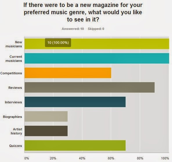
This demonstrates that the audience would like to see a range of things within their ideal music magazine, however the main things include information on new and current musicians as well as reviews. Therefore, along with my front cover and contents page my feature article will take the form of a review, due to the fat that this is something that most of the audience would want to read.


This graph shows very clearly that my product will need to display a colour palette of red, yellow, black, indigo, blue and white as these are the colours the audience wants to see. I will use some of these colours on the cover and contents and then alter the colour palette for the feature article to accommodate all of these colours because using all of them at the same time would make the pages look too busy and overcrowded and it would not fit the common convention of a simple colour palette for rock magazines. 


This question was based on the uses and gratification theory to indicate the exact needs of the target audience in why they want this particular product. The results state that the audience want this product to feel like they are part of a group of like-minded people, to keep them from being bored, to give information about the music, artists and shows and possibly for procrastination and/or to take their mind off of something. So my product will need to be substantial, factual and entertaining. 

Wednesday 13 November 2013

Representation Research

This cover follows Laura Mulvey's theory of the male gaze, using females  “As erotic objects of desire for the characters within the story, and as erotic objects of desire for the spectator."  (Mulvey, 1975), because it features a female dressed quite formally, with pink lipstick allowing her pouting expression to protrude, which is typically seen to be arousing to the male gender, with the pink of the lipstick and the attire connoting love and romance. Furthermore, her positioning can be seen as provocative because she has her hands on her hips and is leaning forwards, towards the audience, and this can be seen as flirtatious and could be an indication of power.
I may use a female in my cover image in order to fulfil the needs of the male audience according to Mulvey's theory.
I may use this theory on my magazine to represent the female audience and also attract the attention of males to read more into my magazine about the female featured.


 This cover conveys the representation of sexuality in a way that is very stereotypical in media "It chooses that aspect of gay male behaviour (SELECTION), inflates it into the defining male characteristic of male homosexuality (MAGNIFICATION), then establish it as the most easily recognizable image (REDUCTION).”  This is demonstrated in this image by the use of leopard print on the clothing of the male on the left. This is seen to be a very feminine thing, therefore to be worn by a male can be seen to be representation of the individuals sexuality, specifically homosexuality. I may not represent sexuality theory in my cover image because the proportion of the target audience for the genre of rock whom are not heterosexual is a minority. I may use this on my magazine to greater my audience by attracting an audience of people of sexual minority that are not always represented on covers. Though the sexual minority audience tend to not listen to this genre of music and therefore this would not necessarily make them want to read the magazine. Also, people of sexual minority are not that common in this genre in terms of artists, and if it is these people don't tend to follow the stereotype set for them and thus it would be hard to represent them in an obvious way that would make them instantly recognizable as in the sexual minority. 


This cover represents two different stereotypes. The first follows the theory of Bill Osgerby about youth when he said that "Crime, violence and sexual licence have been recurring themes in the media’s treatment of youth culture.” (Osgerby, 1998). This is represented on this over by the use of a stereotypical "gang" image with young men, created with use of black (which connotes danger, violence and death), the covering of part of the frontman's face and also with the hammer seemingly cracking the screen. This shows the youth as violent, thug-like and therefore criminals, as Osgerby stated. I will not be using an image like this because I don't want to promote violence and criminality to the audience, even though that goes against a key stereotype of the rock music genre. I may use this on my magazine in order to clarify the audience of youths and attract the attention of an audience that may idolize this kind of youth. However, I don't want to promote violence, so I think this kind of youth representation may not be appropriate for my magazine. 

The second stereotype this cover represents is racism and how "Certain images of Black people as deviant trouble-makers, for example, are perpetuated by the media in order to encourage the mass audience to view blacks in a certain way." This is shown on this cover through the male on the left being of a different race whilst being in a group of seemingly violent and criminal youths, thus conforming to this example of the media forcing certain views upon a mass audience. I won't be using any people of a different race on my cover because, although this example cover goes against this, generally rock music is more targeted at and enjoyed by white people.  

Sunday 10 November 2013

Institution Research

Institution Research 

An institution is a company or corporation that sells products in order to make a profit. The product can be anything, but in this case I’m studying magazine institutions.


Total of consumer magazines in the UK is 2,471, and has an estimated value of £1.4billion. Total of business to business magazines in the UK is 4,395, and has an estimated total of £3.2billion. Together will reach revenues of £7billion by 2014.


 Magazine publishing institutions are constantly diversifying by using an array of platforms, eg tablets, mobiles, social media, online, print and live events, in order to satisfy the consumer’s needs in the ways they find the information they desire.
Magazine publishing institutions are also constantly expanding by buying independent magazines. This creates more money for the institution because the independent magazine will be exposed to a larger audience and therefore more copies will be bought by the reader.


Magazine publishing institutions are usually conglomerations of independent magazines being owned by larger publishing firms, which are then owned by some of the largest institutions in the UK. This allows the correct audiences to be reached on a larger scale, and also allows diversification by creating many different media platforms within the different branches of the conglomeration.

IPC Media is the UK’s leading consumer magazine publisher, reaching an audience of 26million UK adults – around two-thirds of women and around 42% of men. It has 25 million users globally each month, and is split into three publishing divisions. 

IPC CONNECT is aimed at an audience of women, providing print and digital media in areas including fashion, lifestyle, celebrity, television and entertainment. IPC CONNECT reaches 9.4million mass market women every month, which is about 49% of all mass market women. It publishes magazines including Teen Now and TV Easy.


IPC INSPIRE is the men's division, with 38 different brands of magazine is a diverse range of genres so that every man can find a magazine that they can enjoy within their range of products. 


The final branch of IPC Media is IPC Southbank. This focuses on the upmarket woman, producing magazines such as Marie Claire and Ideal Home. This division has a readership of over 10 million due to the this market of women being one of the most magazine-buying audiences that there is. 


I think there is a real gap in their market for my product because within their collection of over 60 magazines, there are only two music magazines, and although one of these, Uncut, is focused on rock, and NME focuses on indie rock (with a mixture of other music), Uncut is targeted at an audience who have grown up in the sixties and seventies and features a lot of classic rock, and NME is a lot more mainstream than the niche market that my magazine fits in. So my magazine being a contemporary rock magazine targeted at an audience of around 16-25, I think there is a gap in IPC's range for a magazine such as mine. IPC’s main magazine competitor is Bauer Media, however this institution distributes Kerrang! Magazine and therefore it would be unlikely that it would also distribute a similar magazine like my own.
 

Sunday 3 November 2013

Photography

Photography

To prepare and design the photoshoot for the images in my print work, I first need to get some ideas and learn professional techniques in order to achieve professional looking shots. I am going to doing this by watching the most professional and/or researched videos I can find on YouTube and this will advise me. 

Lighting: 


From this video I have learnt some of the physics of lighting a subject, and rules two and three are especially helpful in my photoshoot because I can use these to control the intensity of the light on my subjects and how much they are lit when you change the size of the light. 


Mise En Scene: 


From this video I have learnt that positioning within the image is important, which links into the next video, and how the set and shot type is used to convey a specific atmosphere across to the audience. This has shown me that the positioning of my subjects needs to be specific, along with the background and colour scheme, in order to reflect the genre of rock music and create the tense, serious atmosphere I want to achieve. 


This video has furthered the explanation of positioning  and how the shot should be quite full so there's not empty space that's not contributing to the overall image. Furthermore, it said that it's sometimes better to take a large shot and crop it after than trying to take a shot that it perfectly framed, so I will try that. 


Posing and framing: 


This video gives an insight into how indoor photoshoots with bands works and shows many different poses and frames that are common, therefore inspiring different ways I can create a serious yet rebellious atmosphere within my images. 


A photographer I admire:

A rock band photographer whom I admire is Paul Harries. He currently holds the position of Kerrang! magazine's lead photographer and is notably one of the most successful photographers that Britain has to offer. His website is at: http://www.paulharries.com/

Some of his work that appeals to me and gives me inspiration for my own work includes: 


Harries took the shot used as the main image on the Kerrang! magazine cover and the next two shots, which were also for Kerrang! magazine. I really like the positioning of the subjects and the lighting in each of these images so for my photoshoot I will attempt to recreate this style, whilst attempting to make my shots unique to these.

What I think really makes Paul Harries unique is his ability to make every one of his images unique to each other and to other photographer's images through the positioning of the subjects, the props used, the background in relation to the colour scheme of the costume and the way he uses gradient in the background to give the image depth. Also, something that makes Harries so unique is the amount of character he captures in his images. Each band, or individual, that he photographs has their own style or look and Harries takes this and allows the subject(s) to show the audience exactly who they are within the images. This is furthered in the backgrounds of the images, for example;


Analysing Existing Feature Articles

After creating a Prezi discussing the main types of feature articles in the genre of rock music magazines, I will now analyse two feature spreads from existing rock magazines in order to understand the conventions of a successful feature article in; layout, images, colour palette, typography and lexis. These analyses will guide me in creating my own professional-looking double page spread that represents the needs of my target audience. 


The first feature article I am going to analyse comes from Kerrang magazine and takes the form of a biographical feature as it informs the reader of a band’s story from a point after their break up.

The layout of this spread is fairly simple, following the convention of columns, four in this case, approximately two per page, and displays a lot of text, due to the in-depth nature of the article style. This gives the reader a natural and linear journey through the information, and could connote the sadness that the band’s break up brings.

The main of the article sits in the middle of the spread, going across the fold, and is a medium shot of the band’s lead singer front man. His positioning follows the connotation of sadness in that he is looking down, with a ‘straight face’, and not facing the camera and the sizing lets him take up basically an entire page of the spread and allows him to be the main attraction of the article, as if just him being on/in the magazine will make the magazine worthy of buying. The dressing of him is coordinated with the colour scheme. Furthermore, there are two symbols which are part of the band’s identity used in order to personalise the page and the arrow possibly indicates that the article continues over the page, helping the reader to navigate through the feature.

The colour palette consists of black, white, red and blue and represents both the colours associated with the band and also the main colours associated with rock magazines. The use of inversion here could represent the rebellion that the band promoted and "going against the norm to be yourself". This scheme works well for the article because it shows sadness and I guess a kind of state of grieving whilst sticking true to the band and how they’re everything that rock stands for.

The typography used for the spread is very simple, like the rest of it, with only two, possibly only one, fonts used. The first font is for all for all of the lexis in capital letters, and is italicized for the heading quote to recreate the main font associated with the band’s final album. This makes the quote recognisable to the reader as being for this particular band in case the name and/or image isn’t. Using an initial is used to indicate the start of the text, making the first letter of the text extra large, seems to be a convention that I will need to include, as it is shown here, on the next feature I will analyse and on other features I have looked at. The font for the main body of text is fairly standard, following the simple style of the article, but is simplistically inviting for the reader to read for a substantial amount of text and time.

The lexis used within the article is very informal, opinionated and humourous, whilst providing the reader with a detailed account of many aspects of the band’s history. The use of a quote as the article’s heading is good because it sets the tone for the article and adds the band’s point of view to the information in order to back up the writer’s biography and make it a more personal biography.


The second feature article I am going to analyse comes from Metal Hammer magazine and takes the form of an interview feature, in the style of a question and answer.

The layout of this feature is slightly different to the previous one as it has all of the text on one page of the spread and the main image on the other. I think this is a more mature looking layout that is perhaps aimed at a slightly older audience. For the text, three columns are used, so this is a vital convention for me to use in my own print work. The quote on the image makes the quote seem more important and it is very obvious to the reader due to it being in a position where it will be the first thing that the reader sees after they have turned the page, therefore it’s used as a teaser to draw the reader into the whole article. Due to the audience of classic Rock magazine, you can say that this article will be aimed at people in social grade B-C1, which Gandal theorizes as the "social norm" and therefore having a masterclass with such a prestigious rock artist would be advertising to the primary audience.

The main image used for the article is coordinated with the theme of the article as it is about how to be a good musician and it shows two people very involved with music, one of whom being a very influential musician whose presence makes the image work.  The image seems fun and not too serious, setting the tone for the whole article. The image is in black and white, which controls the images coordination with the colour scheme and it kind of opposes the fun and not serious tone that the image itself creates, making it looks more serious. This could correspond to the article being informal and fun, however connoting how serious music is, especially rock music, in how it brings everyone together and helps people get through situations. On the text page there are small cartoon type images; in the form of skulls on the text outline and this add character to the page, making it look more interesting to the reader and fills empty space to make it look more packed with information.

The colour palette follows black, white and red, which are the main colours for rock magazines in general and this makes it look clean and not over powered, but with sufficient brightness to make it look fun and informal.

The typography used is more complex than on the previous feature due to the use of a few more font types as opposed to the two that were used before. The heading is large and very obvious, with a very original style that could be continued thing for all articles like this within the magazine. This alone makes the article look interesting, with the sword through it and the scrolls making it look almost pirate-like, but connoting a lesson from a master of the, in this case, rock music. The sub heading that is situated about the heading contains two different fonts, one very recognisable font that looks a lot like a blood and a slogan type like underneath in a more standard looking font. This subheading may be part of the heading and is continued for all articles of this type. The red caption below the heading and the main body of text is all in the same font, which makes it look professional and not over-designed, which makes the reader more inclined to read it. The quote on the right page has its own font that could correspond to what the quote is saying about sequencing, which is a technical thing and the font looks quite computerised.


 The lexis used is quite simple, and words used like “masterclass” and “visionaries” really make the article sound unique and important. There is also at least one swear word in the article, and this is a theme with the magazine and with rock in general, so to the audience, this doesn’t seem like a band thing, just a sign of awe and interest. 

Styles of Feature Article

Styles of Feature Article 

There are four main types of feature article and I have explored these in a prezi presentation: