Thursday 29 January 2015

Original Images

On set, we took many images, to use for the creation of our posters and double page reviews. Some were taken in between takes, and some were taken by one of our group taking images whilst the filming was taking place. We thought it was important to have a range of different images, so that each of our pieces are unique and we have a plethora of different images to use across the ancillaries. 

Some were also used for the evidence board in the police interrogation scene. 


These pictures of blood/wounds won't be used in my work, but they will be helpful for the creation of the set in the police interrogation scene where we could use real crime scene photographs for the evidence board to make our interrogation room look more realistic and to add some detail to the room.


These images are of the gate and the lock, which were broken via hammer by Sam in the film, and therefore these would be good to use as crime scene scene photos.


This photograph I really like because it shows depth, placement, and is visually interesting. This photograph will be used in one of my group member's coursework and the photo will also go to the crime scene board in the police scene. 


These photographs shows the enormity of the location in which we were lucky enough to film in, and how real the location looked. I'm using the latter on my spread to show the location as a whole, showing the believability of the location, and also because I really like the authenticity of the crumbling jail. 

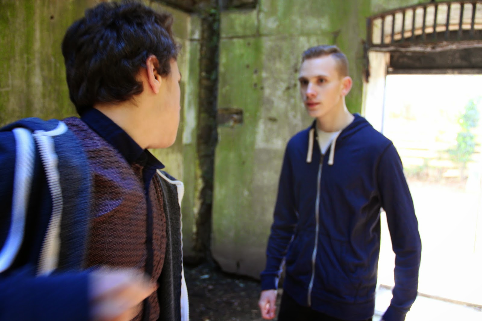
These three stills from the shoot show the fight scene, and therefore the main part of the action in the film. I will use the third photograph on my double page spread because it connotes action, drama, and therefore quality in the film, which may advertise the film to the audience well. 


This is the still I'm going to use as the image on my poster because it's simple, there isn't a lot going on, and I could cut out the subject fairly easily. This will allow me to edit the photograph on my poster to make it look surrealist and abstract, and thus unique and intriguing to the audience. 

Thursday 22 January 2015

Brand Logo

To make our film No Escape recognisable as ours, I have come up with a design ideas for our brand. 

The simplicity of them will link us well to our audience of our generation, as the words 'Level Up', the typography of the text, and the symbols of arrows facing upwards are symbolic of the famous phrase, to 'Level Up'. 

The only possible problem with these designs are that they could mislead the audience into thinking we are a gaming brand, however I think the link to the audience we cater for, our generation, will outweigh this possible problem. 

Overall I think the logos are simple, professional, and relatable to young people, and this is the look I'm going for with the ideas. 

Friday 2 January 2015

Editing Research


Something that we were aware of from the start is that all of our film shoots would take place during the day, and therefore if we wanted the main scenes at the asylum to take place at night, we would have to edit the footage to make it look like it was filmed at night. This tutorial I found by Surfaced Studio does exactly this, and this step-by-step visual tutorial of Adobe AfterEffects is very easy to follow and very easy to do. 

Now, because I've used the main software I'm using, Adobe Premiere Pro, before, it's fairly simple to just get stuck in with editing. In November, I had to make this one minute video for a show reel in a university application and this allowed me to really get to grips with the software and experiment a little before I jumped in with this short film. 


In terms of following editing conventions in the horror/thriller genre, one thing's for sure is that it ranges from long take shot to short take shots in order to build up suspense through dramatic scenes, and this technique goes along with the research of genre conventions I did earlier in the project. This also coincides with what I found in my analyses of existing short films, so I know for definite that this is something that will be effective. 

Another technique is using jump cuts in places to break up footage and allow the viewer to be slightly on edge at times. As horror/thriller films are supposed to keep the viewer gripped in the suspense, throwing in a few jerky shot transition shows the significance of things in shots and builds suspense by using quick shot transitions and giving the illusion that something scary is about to happen. 


This advert is a little group project I participated in, creating a moving image advert for a local camera shop Clemens Photography. This advert was fun to make, and we got to study the conventions of other camera adverts, as well as independently taking all of our equipment to the shop to make an ad without supervision to see what we could do. This allowed us to experiment with camera angles, shots, and movements, and create a little narrative, i.e. the young man walking to the shop and browsing. The editing involved animating images laid over the footage of the spinning cameras, and this was a interesting skill to learn, using the rotation effects on Premiere Pro. There were some challenges whilst making this, for example the cameras spinning on the platform, for which we used a pottery wheel, and spinning this at a constant speed was difficult, as well as making sure the focus was absolutely perfect so that each camera was in focus at every point of its rotation, but in the end I think we did a great job for an amateur moving image advert.