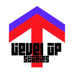
The simplicity of them will link us well to our audience of our generation, as the words 'Level Up', the typography of the text, and the symbols of arrows facing upwards are symbolic of the famous phrase, to 'Level Up'.
The only possible problem with these designs are that they could mislead the audience into thinking we are a gaming brand, however I think the link to the audience we cater for, our generation, will outweigh this possible problem.
Overall I think the logos are simple, professional, and relatable to young people, and this is the look I'm going for with the ideas.

• Time management is good.
ReplyDelete• There is proficient skill in the use of digital technology or ICT in the presentation.
• There are proficient communication skills.
• There is a good level of care in the presentation of the research and planning