For this image I toned it on Photoshop and then cut out the image of the model on the right because I think the focus of him is really good, however not very good n the rest of the image, so I wanted to use this model with the model cut out from the previous picture to create a new image for use on my contents page. So I merged the two cut outs of the two models together to create the main image on my contents page.
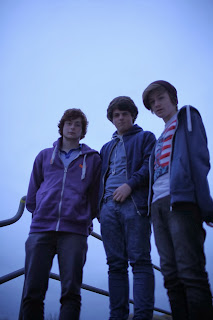
This image was taken in a different photo shoot to the last two, where I wanted to get pictures of the made up band I would use on the cover and the feature article. For this picture we set up the camera and worked out the depth of field to get the best image possible for the cover because the cover image is the most important for attracting the reader, so it had to look good. I especially liked this photograph because the focus is near perfect (slightly out for the model on the left but this gives a good effect in perspective and gives a kind of 'order of importance' to the image, which although all of the band members are important, the lead vocalist, which would be the model on the right, is seen as the frontman for the band, and this makes them more identifiable to the reader. So seeing this model the largest and the clearest allows the reader to recognise the band straight away). Furthermore, the colours are really clear, the natural lighting we used (the sun) gives really nice shadows and light parts on the models' faces and the sky background is really sharp and contributes to the colour scheme really well.
This image is the one I chose to use for my feature article because it's slightly different to the last one, but with a slight change in the contrast and exposure on Photoshop, using a black and white effect and flipping the image horizontally it looks a lot different and complements the layout of the double page spread.
This is my final original image, used on the contents page because I needed a photograph of myself to go next to the editors box. I didn't feel that I needed to edit this photograph because it's in focus and the colours conform to the colour palette enough that they wouldn't need to be changed. the grey background gives contrast against the whiteness of the page and the pink hat in the mise-en-scene complements the red on the t-shirt of a model in the main image on the page.


I just remembered that I forgot to put the last photograph for this on here and then the final screenshot for my constructing my contents page post with the picture on on that post too, but I can't alter it because I don't have a copy of the photograph, sorry.
ReplyDelete