Thursday, 26 March 2015

Audience Research: The Final Touches

For the last few bits editing, I wasn't sure how to approach it, so I decided to go back to my audience to ask what they wanted to see and hear. 


The first question was about CGI and, more specifically, how much should be in the film. Although no CGI won with 60:40, I feel that the 40 need something, so I'll aim to have one cool bit, which I think will probably be the title. 
 

Question two was about layering a scene on top of another and turning the opacity down so you can see both. The results were exactly the same as in question 1, but this time with yes being favoured, so putting a little bit in seems only right. 


The final question regards sound and what the audience really want to hear. Overall, it was down to ambient sound, dialogue, and score and the most popular, so it is these that I will focus on doing well more than any. 
 

This survey was short, but I think it was necessary in giving me valuable information about the sound and final editing bits. 


Thursday, 19 March 2015

Review Article Construction

Firstly, I filled the background with black to follow the colour genre conventions and added an action shot from the film as the main image for the spread. 

Secondly, I added the same film title from the poster to the spread to keep the brand recognisable across all promotional products. I positioned it here to make it look edgy - going across the boarder between the image and the text, and to make it as big as possible because the title of the film is the mia thing you want the reader to come away from the article knowing.

Next I added two stills taken on set to make the spread more visually interesting with multiple images. These stills show the fight scene and the location. 

I then added the info bar, telling the reader the film's release date and the magazine's star rating of the film. I gave it four stars as this is a promotional piece and the better the rating, the more likely the reader is to go away and watch the film. However, giving it five stars would be unrealistic due to the small scale production and it being the first narrative film that I have made.

Next I created a cast and crew box to tell the reader who made the film and who it stars. This box is white and so it constrasts from the dark colours using a reverse of the black and red to make it stand out, but the text in the box is blakc and red making it still conform to the colour palette of the spread as a whole. 

To add the text I used InDesign, where I set the shape of my text and made it all equal in length, and then I copy&pasted it onto my Photoshop document so that it is more professional than created it on Ps and also it makes the text easier to move around as a whole without have to move several text boxes around. 

To make the smaller images look neater and stand out more, and to conform to the common convention in film review pages, I found a film reel brush to put on the images. The design splits each image into two, but this can represent how the genre and how the film is diorientated and jerky in places, as well as giving each part of the image a focus as opposed to seeing the image as a whole. 

A convention of most magazine articles is to have a quote from the text much lare in order to draw in the reader from their first glance of the article. Knowing this, I decided to put my quote in the middle of my text, hence the gap from before, due to the already busy nature of the spread and so that it breaks the text up instead of being one big section. The quote I chose is one of the most positive points from the review, so that even if the reader were not to read the whole article, but just that quote, they would be informed of a positive right form the off, and the font choice is chalk-like to imitate the kind of scratchy writing you would find on the walls of a cell in an asylum, mirroring the plot. 


At this point I felt that the image needed something more to make it fit better with the page, and so I found a blood splatter brush to create the background of a caption box so I could say what the image was. This use of a red blood splatter is symbolic of the content within the film, and also adds more colour to the spread to make it look more appealing to the reader. The contrast of the whote of the text makes the text stand out against the splatter and adds to the occasional brighter colour that constrasts and make the article more appealing to look at. 

I filled the final gap with a banner that says 'Short of the Week'. This alone helps to promote the film by saying that of all of the short film sthat the magazine may have viewed, this was their favourite and therefore this is a promotion to the reader by saying that they should watch it. The use of black and white creates a reverese, making it stand out, and the futuristic font makes the section of the magazine recognisable to film, and for anyone who reads the magazine regularly. 

Lastly, I added the page numbers in the bottom left and right corners. This helps the reader to navigate through the magazine and easily find the article if they wanted to go straight to it from the contents page. The colours are black on the left and white on the right so that they stand out from their background and are lost in the images. 

Wednesday, 18 March 2015

Poster Construction


Firstly, I used coloured fills to of cyan and magenta to create a lilac background after experimenting with the shades of the two colours. I then cut out the subject from the image with the quick selection tool and cut the background. 

Next, I used the liquify function on the Filter drop down menu to create a blurred liquidation of the subject's head so symbolise the explosion of his mind with the schizophrenic voices and hallucinations he experiences. 


Thirdly, I duplicated the cut out of the subject, filled that with an overlay, set that to the vived light texture and moved it slightly to the left so symbolise the subject being almost out-of-body, when he does something int he film that he wouldn't do if he was sane. 

I then used a glass texture, set it to the hard mix filter, and then overlayed it to give the background texture and make is look visually interesting. It symbolises the smashing of the subject's life. 

I then added the text that I had created, in the form of: the credit bar, the released date, and the masthead/title. The title was made by using a fairly standard font, making it capital and bold, and then filling it with a rust texture and setting this texture to the hard mix filter. 

I then added the logos of the company that would make the film, Level Up Studios, and the Distributor, Icon Films. I also added the tagline, for which I made each line slightly different to represent uncertainty, suspense, and lack of control. 


Finally, I overlayed an image of folded paper and turned down the opacity and the fill so that it looks like my poster is a bit old and has been used a lot. 

Thursday, 26 February 2015

Flat Plans

In order to find the best layout for my poster and double page spread, I thought it necessary to design some flat plans so I could decide on the layouts to go for. 


Of the three flat plans I created for my double page spread, I've chosen the latter image because I find this design busy, but not too busy, and original in its presentation of information, for example the caption in a blood splatter. It is also the perfect mix of image and text, with enough text to make the article interesting, but also with enough images to bring the colour and the interesting visuals to the article as a whole. The previous two lack this harmony, with the first having too few images, and the second having far too much text. 


Of the three poster designs, I prefer the last one because it has the explosion of the subject's mind. This is similar to the first flat plan, which has a mushroom cloud, symbolising the explosion, but I think the one of the latter image is much more controlled and easier to be more experimental with, making it more a symbolism of mental illness than of war. The second image features the antagonist of the film, however my audience feedback told me that I should feature the protagonist, and the use of the antagonist would mean restrictions in the design as it would have to have likeness to the film. 

 These flat plans have allowed me to very easily visualise different design ideas I have, and I will endeavour to create a digital version of my favourites for my final products. 

Wednesday, 11 February 2015

Draft Review Article

As my double page magazine review is a promotional product for my film, writing a positive article discussing mostly the pros of the film is going to make the reader of the article want to watch my film, No Escape. Therefore I wrote a draft version before putting it straight on to my double page spread: 


     For a debut short Brit film, this horror-thriller hybrid is not the worst Blair Witch inspired film we’ve ever seen.  Original, unexpected, and with real ghost orbs, the psychological short is still one of the most popular, and constantly surprising, genres for first time film makers.
     What really makes this film is the acting. I don’t know where they got these kids from, but they seem to really bring the characters to life. Franklin (played by Blaine Gosling) is a 16 year-old boy who has been diagnosed with paranoid-type schizophrenia, with vivid hallucinations both auditory and visually that ruin a night documentary making with his best friend, Sam (Jordan Overal). Franklin is consistently aware of his mental illness, yet not being consumed by it. When it comes to the [spoiler alert!] climatic fight scene, he revolts, and the camerawork captures the emotion he’s showing perfectly.
     Now, I know what you’re thinking. “Oh, it’s just another film where a kid sees and hears things that are not there and tries to make a film about it, blah blah, we’ve seen it all before,” but no. You’ve not seen this yet. Yes, the filming plot is just a plot device to let the real action happening, and it is quite clichéd, but when the action parts from this, the narrative takes a turn for the better.
     The main setting for the film is an abandoned asylum, filmed at the dark, historic attraction of Bodmin Jail, Cornwall, and this realistic location gives the whole film a sense of reality. Not only this, but the bustling café scene and the use of a Super 8 camera in the pond scene, though slightly irrelevant to the plot, allows diverse mise-en-scéne to really add to the build up of the narrative. Not only this, but the SFX make up looks real enough to have been done by a Hollywood professional!

     The short ends with a scene so unexpected that I had to take a step back; this a plot twist you don’t want to miss. Despite its evidently amateur appearance in places, this really isn’t a bad first shot at making a short film, especially when made by some A Level kids. Take five minutes of your time to watch and appreciate this film, you won’t regret it.

On review of this article, I think that this is the best article I could have written, being humourous and informative, and therefore this is the version I am going to use for my final product. 

Sunday, 1 February 2015

Poster and Double Page Spread Audience Research

Before starting the creation of my poster and double page spread, I created another survey so that I could make my ancillaries most appealing to the target audience. I put forth four questions, two relating to the colour palettes, and two relating to the images. 

Black and white were chosen the most, closely followed by blue, yellow, and orange, and therefore those are the five colours I will use to create my poster. The black of the costume of the main character could work here, against a blue and white background, and incorporating yellow and orange will be interesting.

Unanimously, black, white and red were the all chosen by everyone that took the survey, which is quite typical for horror review pages, therefore this will be simple to do, and using black as the background colour will work really well here. 

Three images deemed popular, which is a result I agree with, especially when having a large main image on one page. 

The final question was about the content of the image: who/what should it be of? The unanimous decision received if that the image should be of the protagonist of the film. This follows conventions well and will be an exciting way to use imagery to connote the psychological theme in the film. 

Thursday, 29 January 2015

Original Images

On set, we took many images, to use for the creation of our posters and double page reviews. Some were taken in between takes, and some were taken by one of our group taking images whilst the filming was taking place. We thought it was important to have a range of different images, so that each of our pieces are unique and we have a plethora of different images to use across the ancillaries. 

Some were also used for the evidence board in the police interrogation scene. 


These pictures of blood/wounds won't be used in my work, but they will be helpful for the creation of the set in the police interrogation scene where we could use real crime scene photographs for the evidence board to make our interrogation room look more realistic and to add some detail to the room.


These images are of the gate and the lock, which were broken via hammer by Sam in the film, and therefore these would be good to use as crime scene scene photos.


This photograph I really like because it shows depth, placement, and is visually interesting. This photograph will be used in one of my group member's coursework and the photo will also go to the crime scene board in the police scene. 


These photographs shows the enormity of the location in which we were lucky enough to film in, and how real the location looked. I'm using the latter on my spread to show the location as a whole, showing the believability of the location, and also because I really like the authenticity of the crumbling jail. 

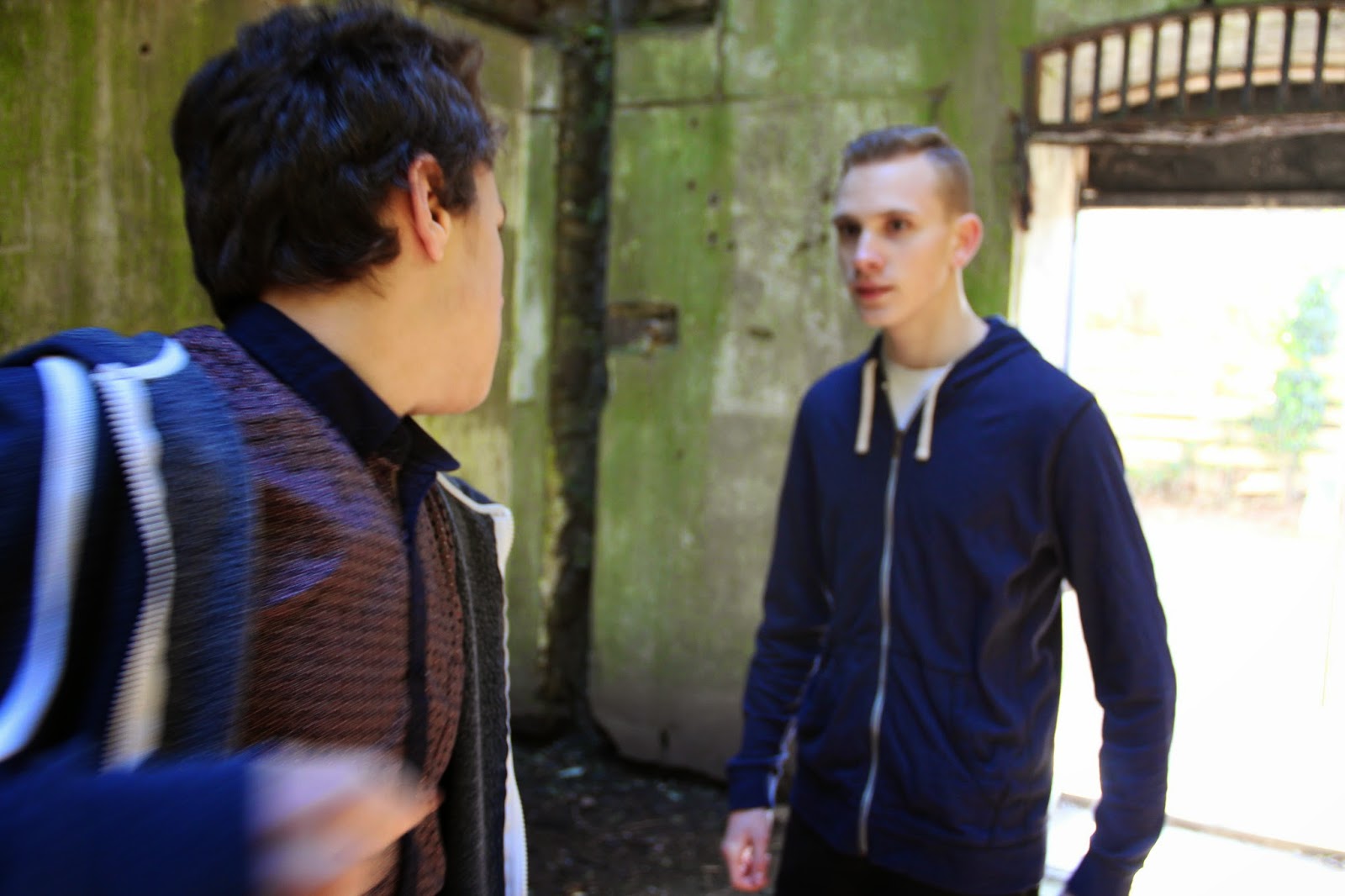
These three stills from the shoot show the fight scene, and therefore the main part of the action in the film. I will use the third photograph on my double page spread because it connotes action, drama, and therefore quality in the film, which may advertise the film to the audience well. 


This is the still I'm going to use as the image on my poster because it's simple, there isn't a lot going on, and I could cut out the subject fairly easily. This will allow me to edit the photograph on my poster to make it look surrealist and abstract, and thus unique and intriguing to the audience.