Friday, 8 May 2015
Friday, 24 April 2015
Wednesday, 22 April 2015


Thursday, 16 April 2015
Audience Feedback
Once I had completed my practical work, I decided to put it back to my target audience to see what their feedback was of the film.


This survey was about getting what they audience thought after watching the final film and seeing the two print accompaniments. The reception was very good, and nobody said they didn't like the products. As per the Blumler and Kats Uses and Gratification Theory (1974), the audience would use my film for escapism, entertainment, socialisation, and information, and the feedback shows that we have effectively responded to the audience's wants with our film. The main improvement suggested was the building of suspense, and this was definitely difficult to try and achieve whilst making the film, so this is a fair comment and I will endeavour to improve my ability to create tension through film in future films that I make. I will not have been able to make a short film that the audience want to watch without the level of audience research I did throughout the project, so this research has been invaluable in helping me make this film.
Friday, 10 April 2015
The Editing Process
As we had quite a few locations, for just a five minute short, and they were filmed at different times, I decided it was easier to edit each scene on its own Premiere Pro document to make it easier to edit the whole film together in the end. I used Premiere Pro because having access to it is great due to it being a state of the art piece of software, and therefore learning to use it is a great way of learning skills early on to progress in my further education of film.

The first scene we filmed and therefore edited was the cafe scene. This had a nice range of shots following Franklin and Sam walking down to the cafe which was really fun to put together. It also didn't involve a lot of overlaying sound or transitions at this point.

Secondly, the pond scene was edited as we filmed this on the same day as the cafe scene, and this was a very simple scene to edit, being just a short transition scene, showing use location and to help the narrative. The editing consisted of just placing the four different shots together and not really much other editing.


Our third shoot was on location at Bodmin Jail and thus we filmed all of the footage needed of this location at the same time due to it costing money for usage. In this, we filmed both scenes 5 and 6, and then edited each in a separate document, like before. This was a bit more difficult, due to the jumps cuts used in scene 5 with Anonymous appearing and disappearing which took a lot of editing to get this effect right. Scene 6 has lots of different sounds added on and overlayed footage which meant that editing this took a few more channels than the previous scenes.

The final scene in the film wasn't the last one we filmed, but it was after the jail scene because we needed the photographs from that shoot to construct the set for this scene. Editing this was probably the most difficult scene yet because the extreme close ups of Franklin's face when he says "I hear voices" was created to be a sort of dazed, dreamlike sequence which involved the repetition of sound and the layering of footage. I used dissolve transitions here to make this sequence look more confusing and visually interesting.

The car scene was simple to edit as there were only two shots to use, and this would be edited further in the final edit as it will be mostly used as a voice over.


The final edit was a lot more difficult to edit because the combining of all of the scenes, with the addition of transitional shots, for example the establishing of the jail and the police station, as well as the addition of some sound effects, the score, the title, and the brand logo. I also had to edit the clips to cut out parts to make sure the time of the film was correct, as well as editing the colour of the final scene to ensure it looked like a conventional police interrogation scene, and finally I added in dissolves to make the shots flow into each other and the change in location smooth and not entirely straight cuts.
I created the brand logo and film title animations on AfterEffects - another state of the art Adobe program that would really enhance my skills upon knowing the basics, and this was predominantly an exploration through the effects that are available on the software that could make my fairly mundane logo and title look a lot more professional and interesting within the film. For the title I used the shatter effect to make the explosion of pieces, and I edited the settings to increase the number of pieces the words shattered into. for my brand logo I experimented with the entrance transitions, so that I could find the visually interesting way for each of the four components of the logo to enter the screen. In the end, I used effects including 3D Tumble, 2D Tumble, Slide and Stretch, and Spin.
Monday, 6 April 2015
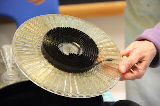
8mm Film Workshop
With film being one of my main interests, an extra-curricular project that I really wanted to get involved in was Loop The Loop: exploring my local heritage through film. The workshop I attended at Loop The Loop was about hand-processing 8mm film using household items, including: instant coffee, vitamin C, washing powder, and salt. This alone I found fascinating, but the experience also allowed us to use the specialised equipment, such as film processing tanks and spirals.
Following our enthusiasm, Joanna Mayes, artist and filmmaker, decided to take our workshop further than planned and teach us how to use an 8mm camera in order to create our own film that day. This involved using an iPhone app to detect light levels and give us accurate information on the f-stop and aperture we should be using in order to make our film look the best it can be, and then we just filmed as many different things as possible; we focused a lot on motion and how it would look on film.
At the end of the day, Jo asked us to come along again the next day so that we could hand-process our own film, and this was a really good end to the workshop as it allowed us to showcase what we had learnt by going through the process ourselves, with supervision by Jo, and process and dry our own work. Whilst doing this, we explained the process to other attendees of the project, and fully cemented what we had learnt.
Overall, the project, I felt, was incredibly interesting, and learning how filmmaking used to be done before everything went digital has inspired me to join the extensive community of people still using old-fashioned film by starting to do this myself in the future. The project as a whole made it into the Cornish Guardian newspaper, and the article featured myself, Joanne Mayes, and Joseph Crowe-Delderfield, a fellow student that attended the workshop.
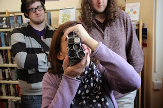


Thursday, 26 March 2015
Audience Research: The Final Touches
For the last few bits editing, I wasn't sure how to approach it, so I decided to go back to my audience to ask what they wanted to see and hear.


Question two was about layering a scene on top of another and turning the opacity down so you can see both. The results were exactly the same as in question 1, but this time with yes being favoured, so putting a little bit in seems only right.
 The final question regards sound and what the audience really want to hear. Overall, it was down to ambient sound, dialogue, and score and the most popular, so it is these that I will focus on doing well more than any.
This survey was short, but I think it was necessary in giving me valuable information about the sound and final editing bits.
The first question was about CGI and, more specifically, how much should be in the film. Although no CGI won with 60:40, I feel that the 40 need something, so I'll aim to have one cool bit, which I think will probably be the title.
Question two was about layering a scene on top of another and turning the opacity down so you can see both. The results were exactly the same as in question 1, but this time with yes being favoured, so putting a little bit in seems only right.
This survey was short, but I think it was necessary in giving me valuable information about the sound and final editing bits.
Thursday, 19 March 2015
Review Article Construction

Firstly, I filled the background with black to follow the colour genre conventions and added an action shot from the film as the main image for the spread.

Secondly, I added the same film title from the poster to the spread to keep the brand recognisable across all promotional products. I positioned it here to make it look edgy - going across the boarder between the image and the text, and to make it as big as possible because the title of the film is the mia thing you want the reader to come away from the article knowing.

Next I added two stills taken on set to make the spread more visually interesting with multiple images. These stills show the fight scene and the location.

I then added the info bar, telling the reader the film's release date and the magazine's star rating of the film. I gave it four stars as this is a promotional piece and the better the rating, the more likely the reader is to go away and watch the film. However, giving it five stars would be unrealistic due to the small scale production and it being the first narrative film that I have made.

Next I created a cast and crew box to tell the reader who made the film and who it stars. This box is white and so it constrasts from the dark colours using a reverse of the black and red to make it stand out, but the text in the box is blakc and red making it still conform to the colour palette of the spread as a whole.

To add the text I used InDesign, where I set the shape of my text and made it all equal in length, and then I copy&pasted it onto my Photoshop document so that it is more professional than created it on Ps and also it makes the text easier to move around as a whole without have to move several text boxes around.

To make the smaller images look neater and stand out more, and to conform to the common convention in film review pages, I found a film reel brush to put on the images. The design splits each image into two, but this can represent how the genre and how the film is diorientated and jerky in places, as well as giving each part of the image a focus as opposed to seeing the image as a whole.

A convention of most magazine articles is to have a quote from the text much lare in order to draw in the reader from their first glance of the article. Knowing this, I decided to put my quote in the middle of my text, hence the gap from before, due to the already busy nature of the spread and so that it breaks the text up instead of being one big section. The quote I chose is one of the most positive points from the review, so that even if the reader were not to read the whole article, but just that quote, they would be informed of a positive right form the off, and the font choice is chalk-like to imitate the kind of scratchy writing you would find on the walls of a cell in an asylum, mirroring the plot.

At this point I felt that the image needed something more to make it fit better with the page, and so I found a blood splatter brush to create the background of a caption box so I could say what the image was. This use of a red blood splatter is symbolic of the content within the film, and also adds more colour to the spread to make it look more appealing to the reader. The contrast of the whote of the text makes the text stand out against the splatter and adds to the occasional brighter colour that constrasts and make the article more appealing to look at.

I filled the final gap with a banner that says 'Short of the Week'. This alone helps to promote the film by saying that of all of the short film sthat the magazine may have viewed, this was their favourite and therefore this is a promotion to the reader by saying that they should watch it. The use of black and white creates a reverese, making it stand out, and the futuristic font makes the section of the magazine recognisable to film, and for anyone who reads the magazine regularly.

Lastly, I added the page numbers in the bottom left and right corners. This helps the reader to navigate through the magazine and easily find the article if they wanted to go straight to it from the contents page. The colours are black on the left and white on the right so that they stand out from their background and are lost in the images.
Wednesday, 18 March 2015
Poster Construction

Firstly, I used coloured fills to of cyan and magenta to create a lilac background after experimenting with the shades of the two colours. I then cut out the subject from the image with the quick selection tool and cut the background.

Next, I used the liquify function on the Filter drop down menu to create a blurred liquidation of the subject's head so symbolise the explosion of his mind with the schizophrenic voices and hallucinations he experiences.

Thirdly, I duplicated the cut out of the subject, filled that with an overlay, set that to the vived light texture and moved it slightly to the left so symbolise the subject being almost out-of-body, when he does something int he film that he wouldn't do if he was sane.

I then used a glass texture, set it to the hard mix filter, and then overlayed it to give the background texture and make is look visually interesting. It symbolises the smashing of the subject's life.

I then added the text that I had created, in the form of: the credit bar, the released date, and the masthead/title. The title was made by using a fairly standard font, making it capital and bold, and then filling it with a rust texture and setting this texture to the hard mix filter.

I then added the logos of the company that would make the film, Level Up Studios, and the Distributor, Icon Films. I also added the tagline, for which I made each line slightly different to represent uncertainty, suspense, and lack of control.

Thursday, 26 February 2015
Flat Plans


Of the three flat plans I created for my double page spread, I've chosen the latter image because I find this design busy, but not too busy, and original in its presentation of information, for example the caption in a blood splatter. It is also the perfect mix of image and text, with enough text to make the article interesting, but also with enough images to bring the colour and the interesting visuals to the article as a whole. The previous two lack this harmony, with the first having too few images, and the second having far too much text.


Of the three poster designs, I prefer the last one because it has the explosion of the subject's mind. This is similar to the first flat plan, which has a mushroom cloud, symbolising the explosion, but I think the one of the latter image is much more controlled and easier to be more experimental with, making it more a symbolism of mental illness than of war. The second image features the antagonist of the film, however my audience feedback told me that I should feature the protagonist, and the use of the antagonist would mean restrictions in the design as it would have to have likeness to the film.
Subscribe to:
Posts (Atom)